Live Chat!
SVX or Subaru Links
Old Lockers
Photo Post
How-To Documents
Message Archive
SVX Shop Search
|
SVX Network Forums Live Chat! SVX or Subaru Links Old Lockers Photo Post How-To Documents Message Archive SVX Shop Search |
IRC users: |
|
#16
 05-08-2001, 12:17 AM
|
||||
|
||||
|
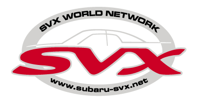
John that logo is really good, and difficult to fault, but here, I'm going to anyway.
The red and grey are a good colour combination, but red is my least favoured SVX colour, I liked the really deep aubergine colour, but then my car is Guinness over Claret. This is a small point, and if most like red [it is striking], then I am more than happy with it. SVX World Network can't be improved. Toby makes a valid point about the white space. Here is my recommendation. "Dome" the top only of the lettering SVX slightly. This will have the effect of pushing the car profile up a little bit. It only needs a very little bit, the outline needs a certain amount of white space around it as a foil to be noticeable. If this doming could add a little downward curvature to the bonnet {hood?} profile, it would be perfect, it currently looks slightly flatter than reality to me. Having said all that, if everyone thinks it's OK as is, I would be happy with it, brilliant job John, and very professional. Joe 
|
|
#17
05-08-2001, 02:20 AM
|
||||
|
||||
|
First of all, my apologies to John Hoffman of the original logo and to John at www.subarusvx.com for use of the pumpkin design without permission. All I did was steal the profile and rearrange some stuff using the "magic wand." POOF! Tell me what you think. BTW, these are just my thoughts on how the logo could be improved, it is not close to a final product, nor would I assume to usurp the old logo.
__________________
-Craig Lowthorp, Flagstaff AZ '92 LS-L, Black on White, 136k SOLD '92 LS-L, Black on Silver, 120k SOLD '01 Legacy Outback, White,
|
|
#18
05-08-2001, 07:10 AM
|
||||
|
||||
|
Craig, I know you said that your version wasn't a final product - but I'm not really with you on this.
Looking at John's latest version - with the comments about it looking bottom heavy in mind - I agree that the SVX logo and window outline element COULD be raised so that they are a little more centered in the oval. The window outline element MIGHT be a little darker, or even black - to give it more emphasis. Other than these two things, in my opinion it's fine - and I'm really happy with it as is. But by all means, have at it - the more ideas, the better.
__________________
Jerry 2005 Baja Turbo 2008 Ford Crown Victoria Police Interceptor jnj7707@yahoo.com
|
|
#19
05-08-2001, 08:46 AM
|
||||
|
||||
|
I must interject a caveat here. I've noticed (as I said in the chat room last night) most who want to "adjust" the logo have not seen it in its "decal" form. To describe: The "gray" parts are actually "silver" and the white area you see inside the oval is actually clear. The lines of the automobile are outline against a clear background. It actually makes a striking decal. Does anyone have a pic of how it looks on a window? This may help those who haven't seen it in decal form appreciate it more. Looking at it a little longer, I fear that, if the car outline is moved up. it may begin to "blend" too much with the curviture of the oval, and get lost, though, I would like to see it with the SVX and car raised slightly to close up some of the space between the end of the letters around the top arc of the oval. Either that or space the lettering out slightly. I'm not really a fan of the red either, but, that's personal preference -- most people think it looks great and, it definitely jumps out. Just don't make it . . . . . . YELLOW! AAAARRRRGGGGHHHHH!

__________________
Randy Johnson 3rd Registered Member 02-21-2001 First Member to Reach 10,000 Posts First to arrive at the very first Reading Meet Subaru Ambassador 1992 SVX PPG Pace Car Replica 110+k 1993 White Impreza L 240+K miles 2001 Legacy Outback Limited Sedan 250+K miles 2013 Deep Indigo Pearl Legacy 3.6R 49+K miles "Reading is my favorite Holiday" Mike Davis -- at Reading VI
|
|
#20
05-08-2001, 09:24 AM
|
||||
|
||||
|
Logo design
Before posting this design, I worked with it extensively and will give you my justifications for what I did.
1. At first glance the design would appear to be bottom heavy. It is intentionally weighted towards the bottom to give it stability; when the logo was centered exactly it appeared to just float. 2. The negative white space at the top is intentional as well. The airiness of the cockpit design is not cramped and is easy to focus on since it is not competing with other elements. In actuality our cars are bottom heavy and much lighter at the canopy, like the logo. 3. The shape of the logo itself is the exact proportional ratio as the Subaru oval in their logo. Since we are a part of Subaru and drive Subaru SVXs I paid homage to the heritage of a design which was in existance long before the SVX was even thought about. 4. The curve of the hood HAS been flattened a little to blend harmoniously with its close proximity to match the curve of the top of the S in the SVX logo. Two different curves did not work well together. Besides its not the slope of the hood which makes this car unique... its the windows, which are dead on I guarantee. (When you see the silver outline of the canopy on the decal surrounded by clear on the windows of the car, you'll see how much it jumps out.) I have been a graphic designer and art director for over 30 years. For every design I submit I have thrown away 10 because they just didn't feel right. I trust my design instincts completely and am standing by this design as it stands. If you want to experiment with something you feel is more appropriate you should do so. I think it may be time for another poll. (On another topic, I sincerely hope the design sense of the person creating the hood scoop on the carbon fiber hoods appeals to those who have put down $650 for something that may be around long after this logo issue is resolved) John
__________________
. Subaru Ambassador 1996 Polo Green LSi #216..138,100 miles...SOLD JFICX8659TH100216.....Date of Manufacture: November 16, 1995..... Fuji Heavy Industries..Ōta North Plant....Ōta City,. Gunma Prefecture, Japan In-Service Date: January 2, 1997 "The Pristine Green Polo Machine First Polo Green on the Network First Clear front turn signals, JDM Alcyone hood emblem, rear panel, and BOXER engine cover on the Network (US) (2000) First 5000K HID factory fog lights (2007) First SVX JDM BBS wheels on a USDM SVX (2013) HID lighting (5000K) for headlight and H3 fog lights, PIAA SuperExtreme 120W high beams, rebuilt EG33 longblock, Cometic head gaskets, Phase II flexplate, AMR aluminum radiator with custom silicone hoses, 160A high-output alternator in aluminum-ceramic coated case, new design alternator wiring upgrade v.4, rare factory headlight protectors, refinished JDM BBS mesh aluminum wheels and custom, polished billet aluminum new hex center caps, LED grille mod, R1 Concepts high-carbon cryo slotted rotors, Akebono ceramic pads, Goodridge S/S braided brake lines, Smallcar Stage 1 shift kit, ThermalTech aluminum/ceramic-coated valve covers, Energy Suspension urethane front & rear swaybar bushings, Bontrager22 rear swaybar with QS Components Chromoly Teflon/Kevlar endlinks, "$15.00/5 minute" suspension mod. Hella Supertone horns, Custom stainless steel exhaust system with 2" headpipes, Magnaflow cats, AeroTurbine AR25 resonator /AWD "Bullet" muffler. R.I.P. 2010 Subaru Outback Limited 2.5 CVT...338,000 miles. Totaled by a 1,300 lb. COW March 4, 2016  2014 Hyundai Avante Limited ...178,000 miles. Actually quieter and smoother than the Outback  2007 Mazda Miata MX-5 PRHT...102,000 miles. Plenty of parts, service and windshields.  4th Registered Network member 2/21/2001 My NEW locker..I...My Email..I..Wikipedia/SVX . . Last edited by svxcess; 03-12-2007 at 07:07 PM.
|
|
#21
05-08-2001, 09:43 AM
|
||||
|
||||
|
Looks fine to me. I don't think it needs changed at all. I just don't put stickers on things so I haven't commented. Check it out, I must be the only mechanic in America that doesn't have even one sticker on his tool box. (Like I'd put a 20 cent sticker on a 5k tool box.)
__________________
Pull my finger!
|
|
#22
05-08-2001, 10:54 AM
|
||||
|
||||
|
Thanks for the explanation, John. Always good to get the why's and wherefore's straight from the originator.
__________________
Randy Johnson 3rd Registered Member 02-21-2001 First Member to Reach 10,000 Posts First to arrive at the very first Reading Meet Subaru Ambassador 1992 SVX PPG Pace Car Replica 110+k 1993 White Impreza L 240+K miles 2001 Legacy Outback Limited Sedan 250+K miles 2013 Deep Indigo Pearl Legacy 3.6R 49+K miles "Reading is my favorite Holiday" Mike Davis -- at Reading VI
|
|
#23
05-08-2001, 11:30 AM
|
|||
|
|||
|
I dig the logo ...
|
|
#24
05-08-2001, 12:42 PM
|
||||
|
||||
|
<<I just don't put stickers on things so I haven't commented.>>
I don't either, but I have two of these on my windshield -- mainly because they're static cling, not "stickers" (if they were "stickers" they would not go on my car either). No goo, no muss, no fuss.
__________________
Randy Johnson 3rd Registered Member 02-21-2001 First Member to Reach 10,000 Posts First to arrive at the very first Reading Meet Subaru Ambassador 1992 SVX PPG Pace Car Replica 110+k 1993 White Impreza L 240+K miles 2001 Legacy Outback Limited Sedan 250+K miles 2013 Deep Indigo Pearl Legacy 3.6R 49+K miles "Reading is my favorite Holiday" Mike Davis -- at Reading VI
|
|
#25
05-08-2001, 03:21 PM
|
||||
|
||||
|
I vote we finalize the latest version of the logo from John. It's clean, based on sound design principles, . . . and I like it!
 Hey, I may not be the graphic artist that John is, but I do know what looks good - and this one is excellent. If there is still strong disagreement on this, let's have some finished alternate versions posted and vote on it.
__________________
Jerry 2005 Baja Turbo 2008 Ford Crown Victoria Police Interceptor jnj7707@yahoo.com
|
|
#26
05-08-2001, 03:28 PM
|
||||
|
||||
|
I'm witcha!
__________________
Randy Johnson 3rd Registered Member 02-21-2001 First Member to Reach 10,000 Posts First to arrive at the very first Reading Meet Subaru Ambassador 1992 SVX PPG Pace Car Replica 110+k 1993 White Impreza L 240+K miles 2001 Legacy Outback Limited Sedan 250+K miles 2013 Deep Indigo Pearl Legacy 3.6R 49+K miles "Reading is my favorite Holiday" Mike Davis -- at Reading VI
|
|
#27
05-08-2001, 03:58 PM
|
||||
|
||||
|
I think John did a great job on the first set and this one with the red is even better.The only thing I would would like to see done is for them to be die cut around the outside to get rid of the extra clear material. I cut my others out myself and it looks much better.
__________________
Mike 92 LSL Teal 103k 00 RS 2.5 Silverthorn Metallic 36k 68 Chevy Camaro 07 Forester XT Sport
|
|
#28
05-08-2001, 06:09 PM
|
||||
|
||||
|
Re: I Like It
Quote:
__________________
Randy Johnson 3rd Registered Member 02-21-2001 First Member to Reach 10,000 Posts First to arrive at the very first Reading Meet Subaru Ambassador 1992 SVX PPG Pace Car Replica 110+k 1993 White Impreza L 240+K miles 2001 Legacy Outback Limited Sedan 250+K miles 2013 Deep Indigo Pearl Legacy 3.6R 49+K miles "Reading is my favorite Holiday" Mike Davis -- at Reading VI Last edited by Aredubjay; 05-08-2001 at 06:22 PM.
|
|
#29
05-08-2001, 07:11 PM
|
||||
|
||||
|
Yep
I am happy enuff with the current. John's points well taken. I would still prefer the hood profile lowered for this reason; loooow hood implies faaaast car. However, John's points are made as graphic designer in relation to how the emblem looks, and if everyone else is happy, as stated before, nihil obstat. Joe
|
|
#30
05-08-2001, 07:36 PM
|
||||
|
||||
|
Go go logo...
It has been a blast sitting back and reading all the discussions about the new club and the new logo....kinda like watching a chick hatch! Glad I kept my mouth shut, 'cause it looks like the products are turning out just fine. However...
<I'm witcha!> ...I'm not sure about warlocks having leadership positions in our club. What's next...spells on those late with their dues?.....SVX's turning to pumpkins at midnight?...trannys treated by eye of newt and toe of frog? Something to think about. If anyone wants me, I'll be in the chat broom...I mean ROOM. Anyone coven with me? Don
|
 |
|
|


 Linear Mode

