Quote:
Originally Posted by Chuckls

I totally forgot about canvas rotating.
Thank you!!!
|
I like playing in Photoshop, I played with some your pics.
So here is a few more helpful hints.
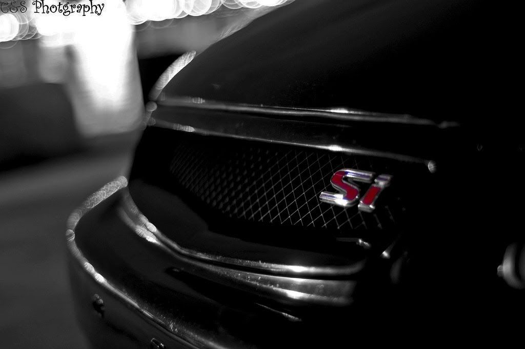
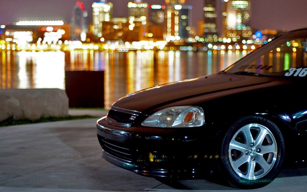
Color balance:
Your blacks in this shot have too much blue/magenta.
Color balance: -18 towards yellow +6 towards green (1 to CCW on this also)
Shadow/Highlight and levels:
I like this shot, but it just seems kind of dulled.
Shadow: 25% Highlight: 75% - Input Levels: 20/1.20/255 (1º CW). Now it looks like a magazine cover!
Hue Saturation:
Wouldn't this look better if the red badge had a little more pop to it?
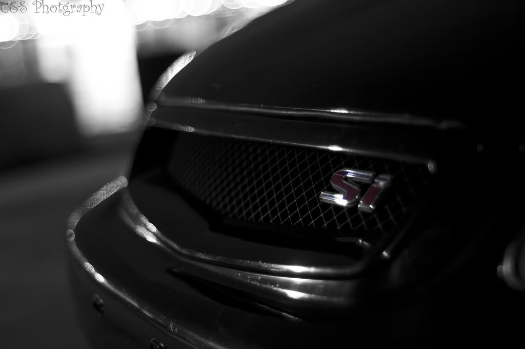
Hue saturation. Reds 100% saturation. 94% Lightness. Nice...But that white doorway in the top left the keeps drawing my eyes from the badge..

Lets fix that with shadow/highlight.
Settings: 5% shadow 47% highlight & Hue saturation: Reds 100% saturation. 94% Lightness. Sweet...